Typography
Learn about our complete typography system, starting with our custom fonts, variable styles, do’s and don’ts, and guidance on how to make an impact with type.
Please Note: In 2025, Square will be transitioning our brand typeface to Cash Sans. This shift is a long-term commitment across Block. To help prioritize the work that should use Cash Sans now vs. what comes later, we’ve put together this Cash Sans Transition Guide for creatives (accessible by internal employees only). Stayed tuned for an update to this page with more in-depth guidance for the Cash Sans transition in H1 2025.
Resources
Below are links to downloadable assets, guides, reference materials, and more. If you’re an external partner, you can download resources from the Brand Asset Library.
Square Sans Display
Square Sans Display
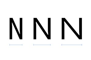
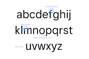
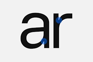
Square Sans Display is our custom variable display typeface used across brand marketing and product — designed to help us amp up our voice and tone and create a strong messaging hierarchy every time. It’s proprietary to Square, and it includes three styles: Standard, Condensed, and Expanded.
We’ve designed and optimized these styles for large sizes and moments of impact. They’re used for larger point-sized headlines, such as headers on square.com, digital and print marketing, and external signage.

Square Sans Display
Styles and weights
Condensed and Expanded styles of Square Sans provide to be more expressive as we reach new audiences around the world. Each style, along with the Standard style, has its own feeling and connects with our voice and tone.
Condensed
Standard
Note: The Standard style is our primary font style. Condensed and Expanded styles will be reserved for limited, specific use cases, such as The Bottom Line blog, social media organic posts, and internal corporate purpose communications. Please do not use Condensed or Expanded styles without formal documented approval from a representative of the Square Brand team.
Square Sans Display
Variable
Want to see how flexible our typeface is and find the right weight and width for your project? Use the sliders below.
Square Sans Display
Character sets
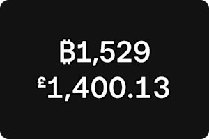
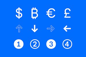
Square Sans Display contains a complete set of diacritics and glyphs for international currencies. It covers more than 45 languages for communciations across our international projects, as we create for markets around the world.
Uppercase & lowercase
A B C D E F G H I J J K L M N O P Q Q R S T U V W X Y Z
a a b c d e f g h i j k l l m n o p q r s t t u v w x y z
Punctuation
% # & “ ‘ ^ ° * ! ¡ ? ¿ @ ( ) / | ¦ \ [ ] { } % ‰ † ‡ § ¶ © ◊ ✓ ℓ ® ™ · • - – — _ . : ; … ‚ „ “ ” ‘ ’ « » ‹ ›
Symbols
∫ Ω ∆ ∏ ∑ √ µ ∂ π + − × ÷ = ≠ > < ≥ ≤ ± ≈ ~ ¬ ∞ ฿ ₿ ¢ ₡ ¤ $ € ƒ ₴ ₭ ₺ ₼ ₦ ₱ ₽ ₹ ₪ £ ₸ ₮ ₩ ¥ ↑ ↗ → ↘ ↓ ↙ ← ↖ ↳ ↵
Accented characters
Á Ă Â Ä À Ā Ą Å Ã Æ Ć Č Ç Ð Ď Đ É Ě Ê Ë Ė È Ē Ę Ğ Ģ Í Î Ï İ Ì Ī Į Ķ Ĺ Ľ Ļ Ł Ń Ň Ņ Ŋ Ñ Ó Ô Ö Ò Ő Ō Ø Õ Œ Þ Ŕ Ř Ŗ Ś Ș Ŧ Ť Ţ Ț Ú Û Ü Ù Ű Ū Ų Ů Ý Ÿ Ź Ž Ż
á ă â ä à ā ą å ã æ á ă â ä à ā ą å ã æ ć č ç ð ď đ é ě ê ë ė è ē ę ğ ģ ı í î ï ì ī į ȷ ķ ĺ ľ ļ ł ĺ ľ ļ ł ń ň ņ ŋ ñ ó ô ö ò ő ō ø õ œ þ ŕ ř ŗ ś š ş ș ß ŧ ť ţ ț ŧ ť ţ ț ú û ü ù ű ū ų ů ý ÿ ź ž ż
Figures
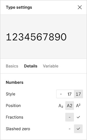
0 0 1 2 3 4 5 6 7 8 9 ½ ¼ ¾ ⁰ ¹ ² ³ ⁴ ⁵ ⁶ ⁷ ⁸ ⁹ ₀ ₁ ₂ ₃ ₄ ₅ ₆ ₇ ₈ ₉
🄋 ➀ ➁ ➂ ➃ ➄ ➅ ➆ ➇ ➈ 🄌 ➊ ➋ ➌ ➍ ➎ ➏ ➐ ➑ ➒
Square Sans Display
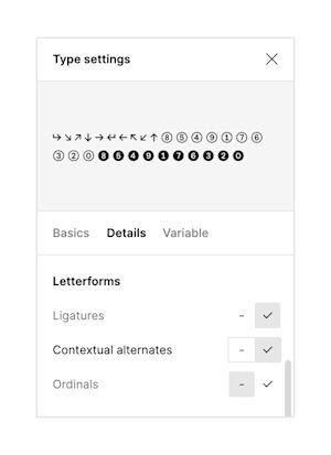
Contextual alternates
To activate contextual alternates in Figma, click the checkmark next to the respective label. Then follow the key commands on this page to get the desired alternate in your design.
Key commands — subway numerals
Key commands — arrows
Square Sans Display
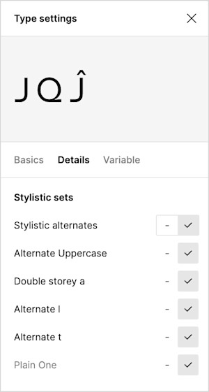
Stylistic alternates
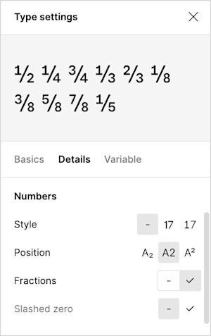
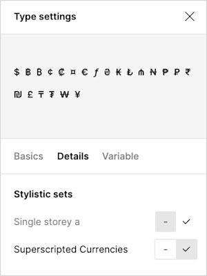
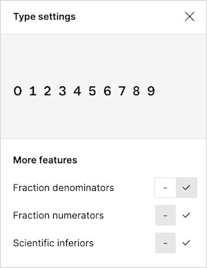
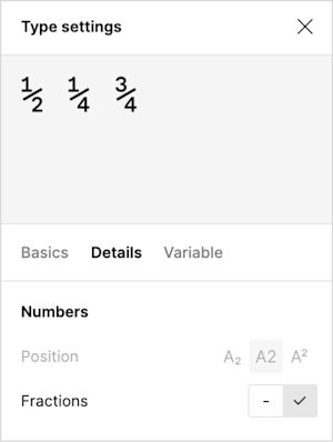
Our set of select alternate characters helps improve spacing between specific letter combinations. To activate our stylistic alternates, check the box next to the respective label under “stylistic sets” or “numbers” in Figma.
Alternates
Square Sans Display
Public web type style sheet
The type sheet below shows how to handle modular scale and create hierarchy with the Square brand typeface across various communications. The scale is based on major thirds, increasing the scale by the same ratio of 1.25.
Square Sans Display
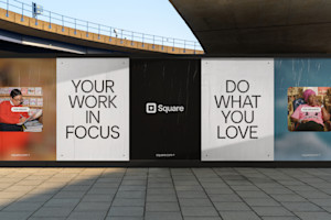
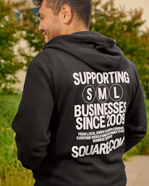
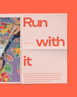
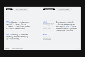
Square Sans Display in action
Square Sans Text
Square Sans Text
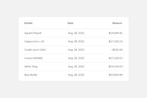
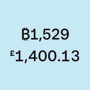
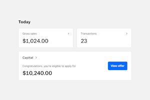
Square Sans Text is our body copy typeface to complement Square Sans Display across brand marketing and product. It’s optimized to display numbers and reads best as body or supporting copy.

Square Sans Text
Weights
To establish clear visual hierarchy and keep legibility at a maximum, we set subtext and smaller copy in Square Sans Text. It’s available in four weights for flexible uses.
Text
Text Italics
Square Sans Text
Character sets
Just like Square Sans Display, Square Sans Text also contains a complete set of diacritics and glyphs for international currencies and covers more than 45 languages.
Uppercase & lowercase
A B C D E F G H I J J K L M N O P Q Q R S T U V W X Y Z
a a b c d e f g h i j k l l m n o p q r s t t u v w x y z
Punctuation
% # & “ ‘ ^ ° * ! ¡ ? ¿ @ ( ) / | ¦ \ [ ] { } % ‰ † ‡ § ¶ © ◊ ✓ ℓ ® ™ · • - – — _ . : ; … ‚ „ “ ” ‘ ’ « » ‹ ›
Symbols
∫ Ω ∆ ∏ ∑ √ µ ∂ π + − × ÷ = ≠ > < ≥ ≤ ± ≈ ~ ¬ ∞ ฿ ₿ ¢ ₡ ¤ $ € ƒ ₴ ₭ ₺ ₼ ₦ ₱ ₽ ₹ ₪ £ ₸ ₮ ₩ ¥ ↑ ↗ → ↘ ↓ ↙ ← ↖ ↳ ↵
Accented characters
Á Ă Â Ä À Ā Ą Å Ã Æ Ć Č Ç Ð Ď Đ É Ě Ê Ë Ė È Ē Ę Ğ Ģ Í Î Ï İ Ì Ī Į Ķ Ĺ Ľ Ļ Ł Ń Ň Ņ Ŋ Ñ Ó Ô Ö Ò Ő Ō Ø Õ Œ Þ Ŕ Ř Ŗ Ś Ș Ŧ Ť Ţ Ț Ú Û Ü Ù Ű Ū Ų Ů Ý Ÿ Ź Ž Ż
á ă â ä à ā ą å ã æ á ă â ä à ā ą å ã æ ć č ç ð ď đ é ě ê ë ė è ē ę ğ ģ ı í î ï ì ī į ȷ ķ ĺ ľ ļ ł ĺ ľ ļ ł ń ň ņ ŋ ñ ó ô ö ò ő ō ø õ œ þ ŕ ř ŗ ś š ş ș ß ŧ ť ţ ț ŧ ť ţ ț ú û ü ù ű ū ų ů ý ÿ ź ž ż
Figures
0 0 1 2 3 4 5 6 7 8 9 ½ ¼ ¾ ⁰ ¹ ² ³ ⁴ ⁵ ⁶ ⁷ ⁸ ⁹ ₀ ₁ ₂ ₃ ₄ ₅ ₆ ₇ ₈ ₉
🄋 ➀ ➁ ➂ ➃ ➄ ➅ ➆ ➇ ➈ 🄌 ➊ ➋ ➌ ➍ ➎ ➏ ➐ ➑ ➒
Square Sans Text
Contextual alternates
To activate contextual alternates in Figma, click the checkmark next to the respective label.
Alternates
Square Sans Text
Product type style sheet
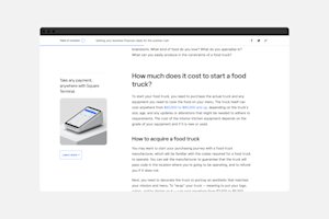
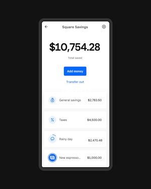
The product type system prioritizes legibility and ease of use. It includes more styles at smaller sizes to account for greater density of information. Most product type styles use Square Sans Text, with larger styles using Square Sans Display.
Product supports dynamic type for accessibility. The system can scale up and down depending on user settings.
Square Sans Text
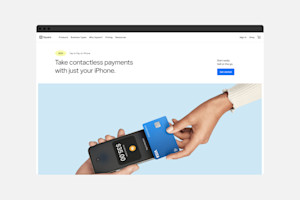
Square Sans Text in action

Square Sans Mono
Square Sans Mono
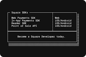
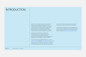
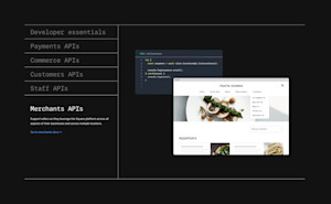
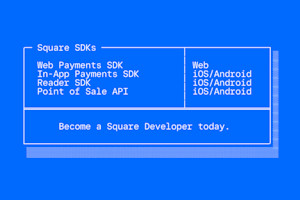
In 2023, the developer team, in partnership with the global brand studio team, set out to create a mono version of our Square Sans typeface. The primary goals of this new cut are to support the developer visual identity and to allow a better reach to that audience.
With Square Sans Mono being a core element of the developer visual identity, the developer team can use Mono in any way that best supports their work in product and marketing experiences.
However, for Square teams, Square Sans Mono is meant as a complement — not a replacement — to Square Sans Display and Text.
Square Sans Mono
Weights
The type weights of Square Sans Mono were crafted to work harmoniously with both Display and Text.
We do not recommend mixing the fonts together within a headline or body copy unless it’s to represent code.
Mono
Square Sans Mono
Character sets
Square Sans Mono is offered as a variable font that contains a complete set of diacritics and glyphs for international currencies. It covers more than 45 languages for communications across our international projects.
Currently it does not support Japanese.
Uppercase & lowercase
A B C D E F G H I J K L M N O P Q R S T U V W X Y Z
a b c d e f g h i j k l m n o p q r s t u v w x y z
Punctuation
. , : ; … ! ¡ ? ¿ · • * # / \ ( ) { } [ ] - – — _ ‚ „ “ ” ‘ ’ « » ‹ › “ ‘
Symbols
฿ ₿ ¢ ₡ ¤ $ € ƒ ₴ ₭ ₺ ₼ ₦ ₱ ₽ ₹ ₪ £ ₸ ₮ ₩ ¥ ∙ ∕ + − × ÷ = ≠ > < ≥ ≤ ± ≈ ~ ¬ ^ ∞ ∫ Ω Δ Π Σ √ μ ∂ % ‰ ↑ ↗ → ↘ ↓ ↙ ← ↖ ↳ ↵ ✓ @ & ¶ § © ® ™ ° | ¦ † ℓ ‡ ℮
Accented characters
Á Ă Â Ä À Ā Ą Å Ã Æ Ǽ Ć Č Ç Ĉ Ċ Ð Ď Đ É Ĕ Ě Ê Ë Ė È Ē Ę Ğ Ĝ Ģ Ġ Ħ Ĥ IJ Í Ĭ Î Ï İ Ì Ī Į Ĩ Ĵ Ķ Ĺ Ľ Ļ Ŀ Ł Ń Ň Ņ Ŋ Ñ O Ó Ŏ Ô Ö Ò Ő Ō Ø Õ Œ Þ Ŕ Ř Ŗ Ś Š Ş Ŝ Ș Ŧ Ť Ţ Ț Ú Ŭ Û Ü Ù Ű Ū Ų Ů Ũ Ẃ Ŵ Ẅ Ẁ Ý Ŷ Ÿ Ỳ Ź Ž Ż Ƶ
á ă â ä à ā ą å ã æ ǽ ć č ç ĉ ċ ð ď đ é ĕ ě ê ë ė è ē ę ğ ĝ ģ ġ ħ ĥ ı í ĭ î ï ì ij ī į ĩ ȷ ĵ ķ ĸ ĺ ľ ļ ŀ ł ń ň ņ ŋ ñ ó ŏ ô ö ò ő ō ø õ œ þ ŕ ř ŗ ś š ş ŝ ș ß ŧ ť ţ ț ú ŭ û ü ù ű ū ų ů ũ ẃ ŵ ẅ ẁ ý ŷ ÿ ỳ ź ž ż ƶ
Figures
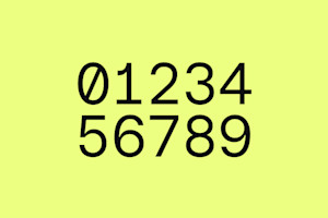
0 1 2 3 4 5 6 7 8 9 ⁄ ½ ¼ ¾
🄋 ➀ ➁ ➂ ➃ ➄ ➅ ➆ ➇ ➈ 🄌 ➊ ➋ ➌ ➍ ➎ ➏ ➐ ➑ ➒
₀ ₁ ₂ ₃ ₄ ₅ ₆ ₇ ₈ ₉ ⁰ ¹ ² ³ ⁴ ⁵ ⁶ ⁷ ⁸ ⁹
Square Sans Mono
Box drawing glyphs
Box drawing glyphs are intended mostly for Command Line Interface (CLI) and type directory-like structures in code.
▁ ▂ ▃ ▄ ▅ ▆ ▇ █ ▀ ▔ ▏ ▎ ▍ ▌ ▋ ▊ ▉ ▐ ▕ ▖ ▗ ▘ ▙ ▚ ▛ ▜ ▝ ▞ ▟ ░ ▒ ▓ ● ○ ◊ □ ◼ ▲ ▶ ▼ ◀ △ ▷ ▽ ◁ ╦ ╗ ╔ ═ ╩ ╝ ╚ ║ ╬ ╣ ╠ ╥ ╖ ╓ ┰ ┒ ┧ ┎ ┟ ╁ ┯ ┑ ┩ ┍ ┡ ╇ ╤ ╕ ╒ ╍ ╏ ╻ ┳ ┓ ┏ ━ ╸ ╾ ┉ ┋ ╺ ┅ ┇ ╹ ┻ ┛ ╿ ┗ ┃ ╋ ┫ ┣ ╅ ┭ ┵ ┽ ┲ ┺ ╊ ╃ ╮ ╭ ╯ ╰ ╳ ╲ ╱ ╌ ╎ ╷ ┬ ┐ ┌ ─ ╴ ╼ ┈ ┊ ┄ ┆ ╵ ╽ ┴ ┘ └ │ ┼ ┤ ├ ╆ ┮ ┶ ┾ ┱ ┹ ╉ ╄ ╨ ╜ ╙ ╀ ┸ ┦ ┚ ┞ ┖ ╈ ┷ ┪ ┙ ┢ ┕ ╧ ╛ ╘ ╫ ╢ ╟ ╂ ┨ ┠ ┿ ┥ ┝ ╪ ╡ ╞
Square Sans Mono
Code-oriented ligatures
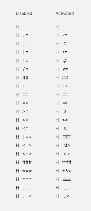
Using our core character set as a base, the characters seen here have been extended into a series of code-oriented ligatures. The ‘’H’’ in the examples below are used for cap height visual support.
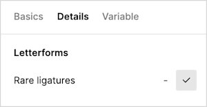
Code-oriented ligatures are not enabled by default. To activate code-oriented ligatures in Figma, click the check mark next to the ‘’Rare ligatures’’ label.
Square Sans Mono
Contextual alternates
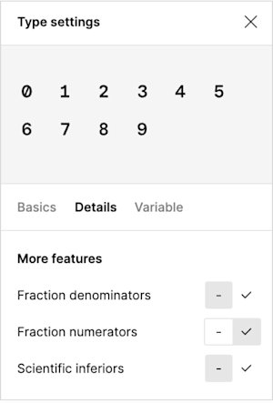
To activate contextual alternates in Figma, click the checkmark next to the respective label.
Alternates
Square Sans Mono
Stylistic alternates and large punctuation
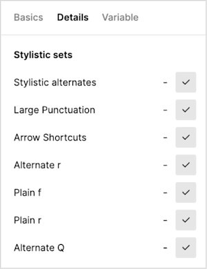
When Square Sans Mono is used at a smaller size, such as in code blocks or in documentation, it’s possible to activate large punctuation to make characters easier to identify. To activate, check the ‘’Large Punctuation’’ box under ‘’Stylistic sets.’’
Contrary to Square Sans Display and Text, arrow shortcuts need to be activated. To activate, check the ‘’Arrow Shortcuts’’ bux under ‘’Stylistic sets.’’
To activate our stylistic alternates (lowercase ‘’f’’ and ‘’r,’’ and uppercase ‘’Q’’) check the box next to the respective label under “Stylistic sets.”
Alternates
Square Sans Mono
Do’s and don’ts
The following examples highlight a variety of correct and incorrect uses of Square Sans Mono.
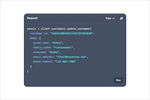
When showing code in abstract UI, in supporting visuals, in code examples, etc.
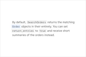
Guidance that includes code snippets
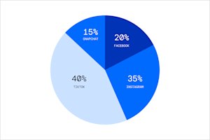
Data visualization in marketing and communication applications
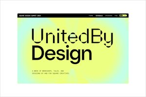
Campaigns/reports and internal projects (However, keep its usage purposeful and make sure it serves the overall intent of the message.)
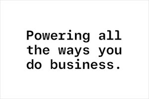
Do not use it for headlines (unless it’s part of a campaign/report visual identity).
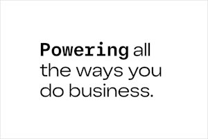
Do not mix and match with Display or Text in the same headline/sentence.

Do not use it for body copy.

Do not use it for CTAs.
Typography logic
Typography logic
Tonality of our different type styles, usage specs, and do’s and don’ts for mixing styles
Typography logic
Approach
Different versions of Square Sans Display can change the tone, message, and overall feeling of a design. Nailing the right tone is crucial as we connect with people doing business in every stage and form.
Writing and typography go hand in hand. Here’s how our type styles map to the personality traits from our foundational voice and tone. They’re not mutually exclusive, but they’re a good starting point.
Square Sans Display Condensed — Bold
The future of business works together.
Personality trait
Unapologetically inclusive
Takeaway
Square is empowering.
Square Sans Display Standard — Regular
The future of business works together.
Personality trait
Grounded optimists
Persistent problem-solvers
Takeaway
Square is trustworthy.
Square Sans Display Expanded — Medium
The future of business works together.
Personality trait
Courageous visionaries
Takeaway
Square is progressive.
Square Sans Display Condensed
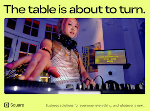
Condensed gives off feelings of confidence and boldness. It works well in all caps and sentence case. Best use cases for Condensed are campaigns with cultural initiatives and editorial moments.

Square Sans Display Standard
Standard is clear, concise, and to the point. It works well in all caps or sentence case. Its accessibility and legibility make it versatile, and its simplicity lets it take a back seat in certain situations so our visuals can shine, especially in product moments.
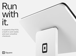
Square Sans Display Expanded
Expanded is our future-focused type style. Designed to stand out and command attention in messaging, it’s progressive with an edge. It works best in sentence case in awareness-level messaging, ads, and anywhere we talk about what’s next for business owners.
Typography logic
In-use specs
You can use different styles of our typeface in a layout, but make sure you keep it consistent. For example, if you use the Standard style for a headline, it should be used for all headlines in your design.
This breakdown gives you a starting point for how to use different type styles together. They can be used differently while following the provided guidance.
Square Sans Display Condensed
FEATURED PRODUCT
Square Sans Display Standard
Fast and intuitive checkout
Square Sans Text
Square Stand has a customer-driven checkout and built-in card readers with guiding LED lights, so the customer can confirm their order and pay.
One simple device that’s easy every step of the way. Just download the Square Point of Sale app and start selling — no training or service visits required.
Square Sans Display Expanded
“My customers love it. It’s clear, concise, easy to read, and they know exactly what they’re paying for.”
Square Sans Text
Trina Gregory-Propst,
Se7en Bites
Typography logic
Don’t mix fonts
Do not combine different cuts in the same headline, sentence, or body copy. These kinds of type combinations make legibility and accessibility difficult and can cause confusion for the reader.
Mixing type styles can result in an odd visual contrast and can appear unbalanced to the eye.
Make sure you map back to our typographic standards and best practices to ensure consistency and a cohesive tone.
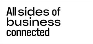
Condensed and Expanded mixed in a single headline

Condensed and Expanded mixed in a single headline
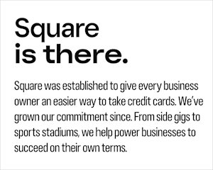
Regular and Expanded mixed in a single headline; Condensed set as body copy
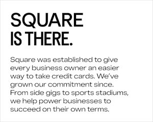
Regular and Condensed mixed in a single headline; Expanded set as body copy
Related Content
