Design primitives
We use a variety of design elements to pair with photo/video and enhance the level of information we serve up. This section gives a detailed look at each type of design primitive.
Resources
Below are links to downloadable assets, guides, reference materials, and more. If you’re an external partner, you can download resources from the Brand Asset Library.
Card system
Card system
Cards hold many types of content. They can be responsive and flex to different canvas sizes while providing emphasis within a larger piece.
When used on top of photography, they help with legibility and focus. You can use the different colors in our primary color palette (except for Market Blue) that fit with the photo to create the best contrast.

Card system
Margins guidance
Here are a few tips on good ways to use cards consistently.
((1)) Exterior margins
When cards are close to the canvas edge, the space should be at least equal to the minimum spacing around our logo, which is three times the middle of our Square Jewel. It should also be even on all sides.
((2)) Interior margins
Interior space should be at least equal to the minimum spacing around our logo and even on all sides.
((3)) White space
Make sure space within cards helps give the content breathing room and a clear hierarchy.

Card system
Corner radius
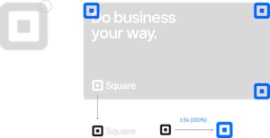
Corner radii are calculated by mapping the exterior radius of our jewel and scaling it up 1.5 times (150%) its final size in any layout. All four corners should have the same corner radius. This allows for a balanced, consistent relationship between a card’s corner radii and our logo. Additionally, it ensures consistency throughout all content that uses our card system.
Card system
Correct usage
The following examples highlight correct uses of our card system.

Cards can be placed in the top left of a horizontal canvas.

Cards can be placed in the right portion of a horizontal canvas.

Cards can be placed in the bottom portion of a vertical canvas.

Card color should complement rather than compete with the focus of the image.
Card System
Incorrect usage
The following examples highlight incorrect uses of our card system.

Do not place the card over the image’s focus.

Do not cover more than 50% of the canvas.

Do not use Market Blue as a card background color.
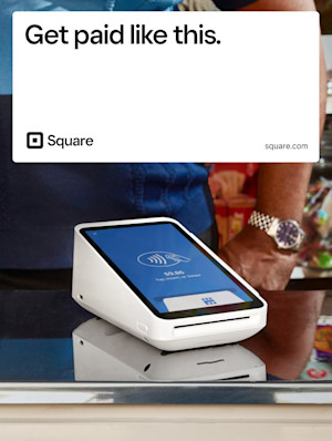
Do not place cards on the top portion of a vertical canvas, as it can feel top-heavy.
Card System
Logo size and content hierarchy
Be mindful of content hierarchy when using cards. The final size of the logo dictates the corner radii and the exterior and interior margins of cards. Make sure to strike the proper visual balance between the different elements of your composition.
The type of collateral you work on may also influence how big certain elements should be. The approach to how we treat the size of our logo will differ from an out-of-home billboard versus a display banner ad. Use your best judgement so your design is balanced visually.

Balanced relationship between logo and headline
Proper interior/exterior margins sizes

Too large of a logo in relation to the headline
Too much interior/exterior margin space; floating content within card
Abstract UI
Abstract UI
We use abstract UI to emphasize and support a concept or a specific product feature. The UI should be from the audience’s perspective, or someone would see it when they use the product. Abstract UI can also be paired with visuals to provide more context and tell a clear, complete story.

Abstract UI
Design guidance
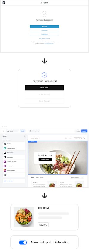
If you need to create abstract UI, always refer to the original screen. Then explore what to take away and simplify so it’s as simple as possible.
Reduce color and text.
Keep the large interface monochromatic and highlight the focused parts with black or one branded color. Reduce text by selectively turning secondary text into gray bars.
Create focus.
Pull out necessary components from a larger interface to highlight a specific feature. You can also combine more than one feature to support a concept.
Make a large screen small.
Eliminate white space from the original screen and keep only the necessary components or features to make a compact version of the UI.
Frost UI
Frost UI
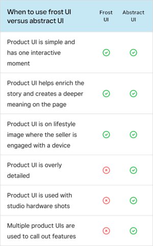
Frost UI provides easy-to-understand examples of micro-interactions with our software when someone is engaged with a device, preferably when the device screen isn’t visible. Like abstract UI, the perspective is always from the audience’s point of view.
As a container for different types of UI content, frost UI is designed to flex with different canvas sizes. The UI moment you choose might not be enough to tell the story alone, but with the right image pairing, it can complete the picture.

Frost UI
Design guidance
Simplicity
Frost UI tells a story between the product and the seller. The UI should be easy to understand and should focus on one simple interactive moment.
Photography
Frost UI only works on top of lifestyle photography in which someone is engaged with a device, ideally when the UI screen isn’t visible.
Typography
Always set the primary typeface for frost UI in Square Sans Text. The fewer text sizes in one frame, the better.

Frost UI
UI color guidance
Our UI elements show up in black, white, Market Blue, and gray. Keep color use simple so it doesn’t distract from the photo.
Banners and social
Text should always be white, UI should be white or gray, and CTAs should be black. Market Blue can be used as an action item on UI elements, but only if the actual product uses it the same way.

Square.com
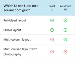
If you use frost UI on our web pages, stick to black, white, and shades of gray. Using Market Blue makes text look like links, which may confuse readers.

Frost UI
Usage
Software frames
Software frames
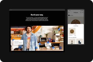
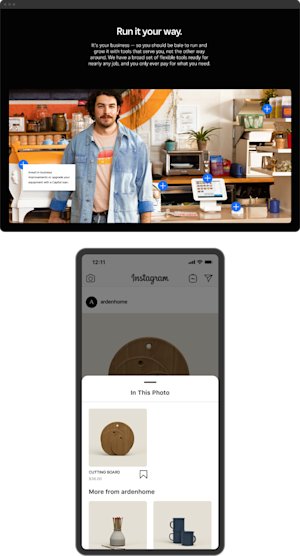
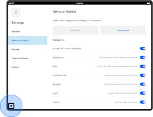
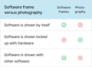
Software frames are exactly that: agnostic device frames that reinforce the function of the software and differentiate it from photo-realistic devices.
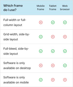
Software frames should be used when the software is the hero product in a full-width section, a grid-width section, or a full-bleed side-by-side section.
Software frames
Design guidance
Dark vs. light frames
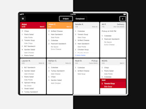
We use dark frames on light backgrounds and light frames on dark backgrounds for the best contrast.
No drop shadow
The focus should be on the software inside and not on a drop shadow or the frame itself.
Scaling
Use the scale tool to preserve the right corner radius and make the frame border the appropriate thickness for small devices.
Software frames
Design detail
As we mentioned above, the corner radius of our frames is based on the shape of the Square jewel to ensure brand consistency.
Software frames
Photography
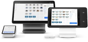
Photography or realistic renders of phones and tablets can be used only when locked up with Square hardware. If these aren’t shot with the actual hardware in the studio, please make sure you partner with someone on the photo or production teams to adjust the shadows for each device.
Software frames
Frame selection
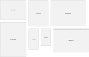
On desktop, use the tablet frame and wider layouts. On mobile, switch to abstracted layouts. If you need a frame for context, use the scaling tool to scale the software to the size you need.
Related Content

